An international boutique children’s clothing chain commissioned us to initiate a regional roll-out of their brand. We chose to provide a clean and bright background aesthetic, which would be subordinate to the colorful and playful tones of the clothing and displays. Track and pendent LED accent lighting were strategically placed to let the product “shine through”
Retail
-
-
Jewelry Store
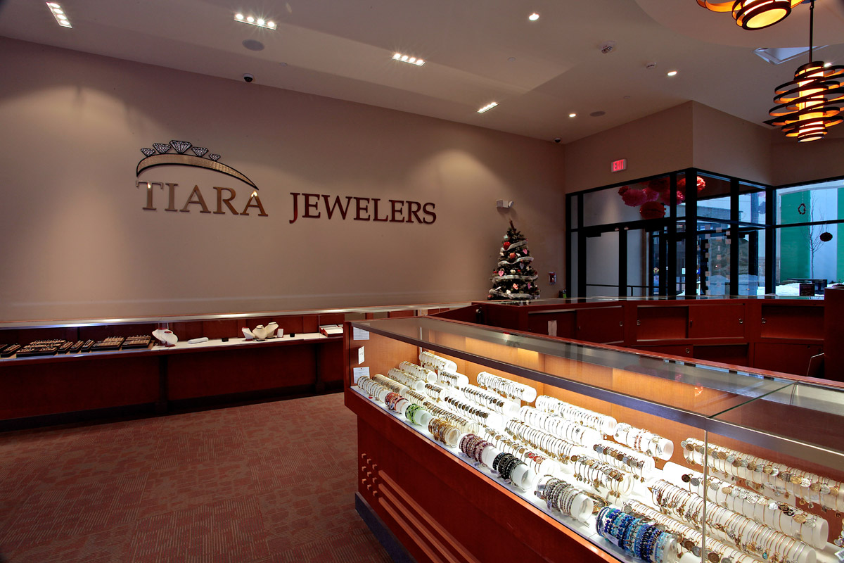
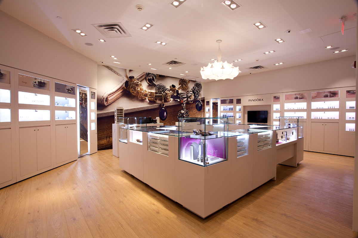
This project involved a boutique jewelry store fit out in a newly constructed shopping mall. Our minimalist approach incorporated distinct functional zones wrapped in a warm, yet modern aesthetic. The clean lines and high-tech lighting are balanced by a “living room” with a backdrop fire place wall of cultured stone.
-
Jewelry Store
We sought to emphasize and juxtapose a clean and clear geometry for this new jewelry store located in an urban shopping mall. From the exterior we wanted to create the image of a series of jewelry boxes floating within the space, the largest of these being the display window. Each “jewelry box” is further broken down into individual display cases as one moves thorough the space.
-
Sports Memorabilia Store
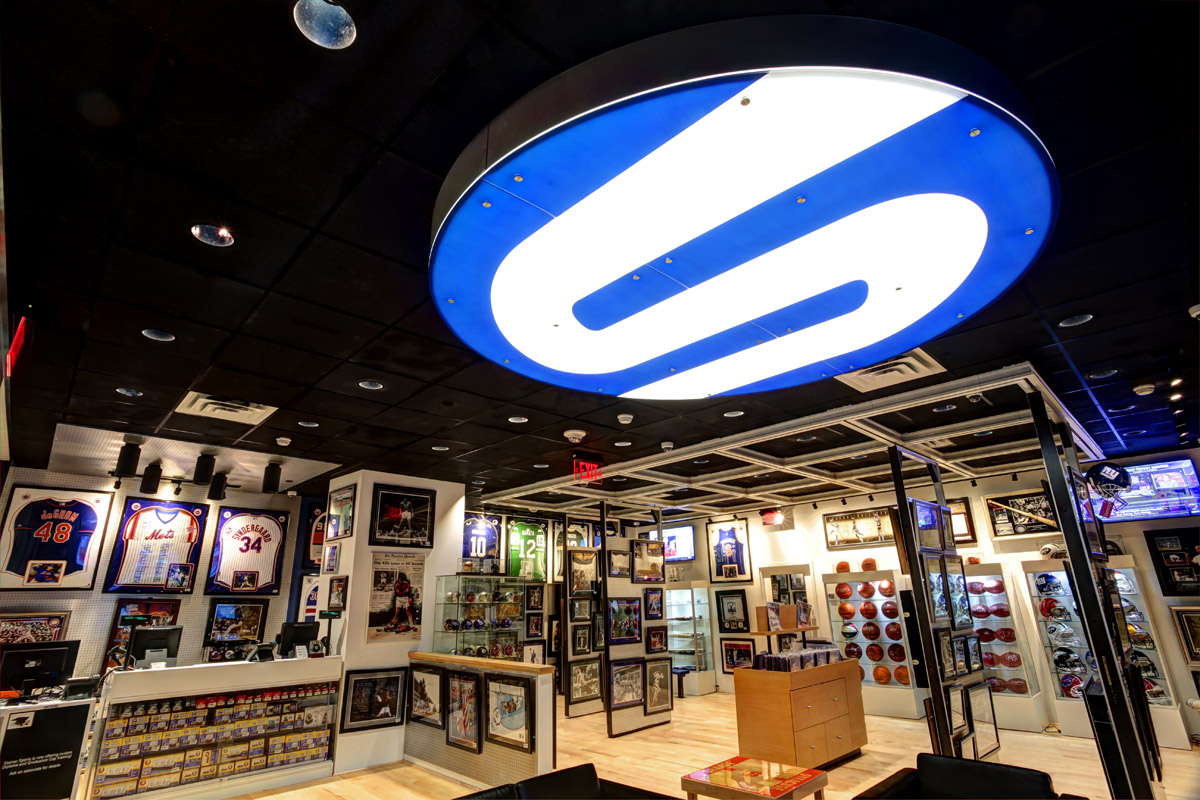
A national leader in sports memorabilia asked us to design and brand their retail identity in a suburban mall setting. Our challenge was to house their extensive collection in a relatively small location without making the space feel cluttered. We created a floating display panel system that allows the space to adjust to its changing inventory and also create open space for events and autograph signings. A sliding by-passing wall panel system allows Steiner to double its wall display space in the same square footage. These custom display systems efficiently present a high volume of inventory in a playful way that leaves plenty of space for a “man cave”, multi-media video screens, comfortable seating and game tables.
In retail architecture, the key is to create a bright, clean aesthetic that compliments the products being sold without competing with them. Unobstructed sight lines from the exterior of the space should draw shoppers inside by creating a sense of excitement and energy. It is also important to understand and emphasize the brand identity of the product or service and to clearly communicate that brand across the design.
We often seek to use simple geometric forms in interesting ways to emphasize and contrast the sales areas from circulation paths. These geometric “islands” create a clear, defined axial path through the space, while implying a sense of movement and energy.
Wall and floor finishes are quite often designed to be monochromatic in order to provide a backdrop for the display areas, bringing them more into the foreground and placing ones attention where it belongs, on the goods being sold.


